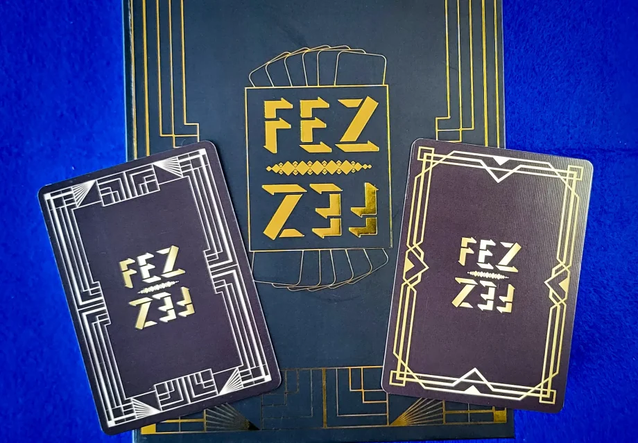
Over the moon describes how I feel about the prototype I received from WJPC, even though I might not have sounded it during the unboxing video, that’s just me.
After spending some time looking at the product with a critical eye(see photos here) as one has to to see it without the rose tinted spectacles on and to try and be objective, this is what I think. I am also getting feedback from others and will incorporate their feedback into any redesigns I need to do.
Outer Box
The front of the box is absolutely fine, no problems, it is centred and looks the part, very sleek. The proportions of the elements and title are balanced, nothing to change here.
The spine,… I need to move the graphic elements about 1/2mm to the left to centre them. The vertical centering is perfect and matches up with the front logo perfectly.
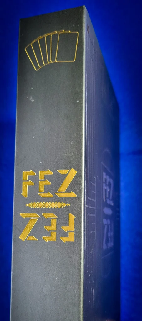
Looking at the back of the box, there is a list of things I need to change…

- Rework the colours on the logo, make the cream creamier and less muddy and dark. The red needs to be lightened up a bit too, it looks more like 1940s-1950s diner look which is wrong!
- The white cards on the logo need to be redesigned, they don’t fit with the logo on the outside of the box, I need a moew coherent design
- The copy blurb needs to be rewritten, and a picture of the box contents. I don’t think the text makes people wanna pay, open and play.
- I need to know what legislation requires me to have on the box
- I need a barcode, so research to find out what I have to do for that.
- and a QR code that will take people to a website page and show them some pics, video, etc and an Augmented Reality app to see the game in AR
The paper edges on the sides of the box look good, although the where the paper has been cut and folded needs to be looked at, or at the least, I can rework the layout so that is as seamless and blended as possible.
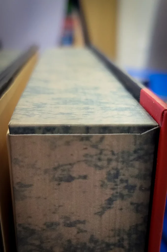
As noted by WJPC the thickness of the box needs to be deeper, maybe by 1-2mm no more. This is because the thickness of the leaflets and envelope are thicker than expected, due to the quality of paper and card used.
Inside Cover
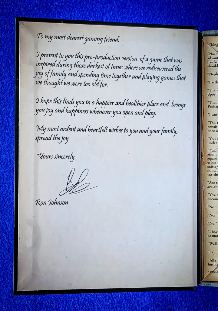
This just needs to be given more margin space all around, there is too much empty space at bottom right hand side. If there is still some space I might put a light line drawn image in the bottom right, something in keeping with the 20’s theme obviously.
Envelope
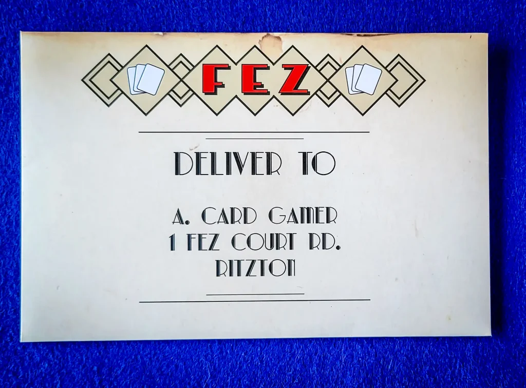
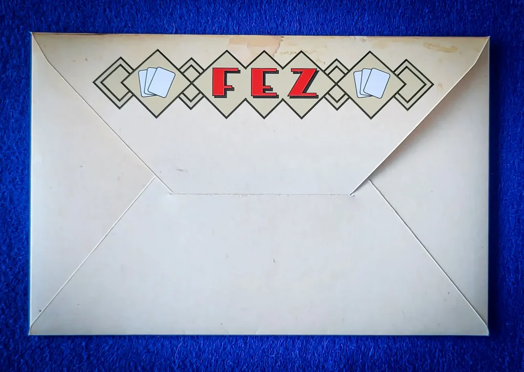

The only 2 things I need to change are the logo, it looks more 50s than 20s. The cream colour isn’t creamy enough and looks a drab muddy cream and the red needs to be lightened up a bit I think.
Also the white cards on the logo need to be changed as they aren’t consistent with the cards on the box outer.
The only other addition I think I’ll try is to add a faux red wax seal to the envelope. Probably not in keeping with the 20’s theme, but a bit of research and artistic license may have to be taken.
Instruction Leaflets
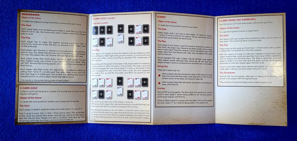
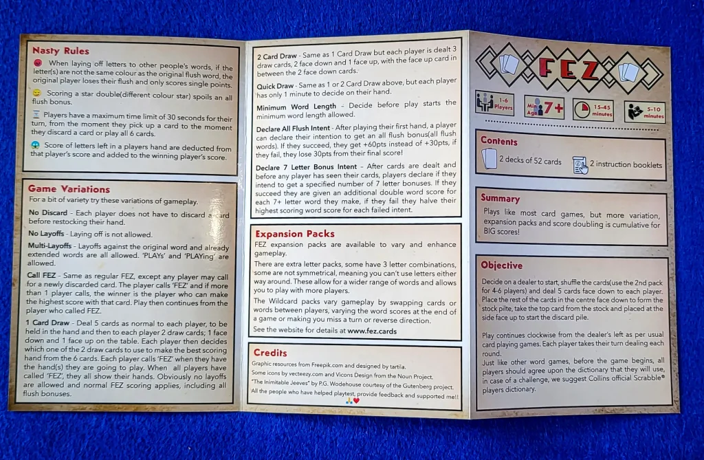
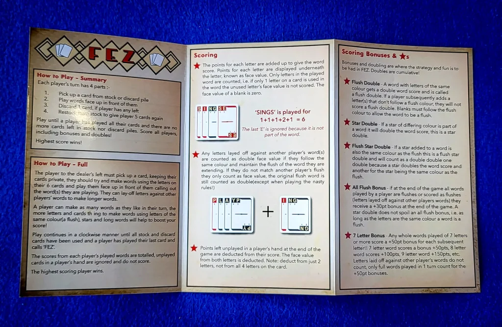
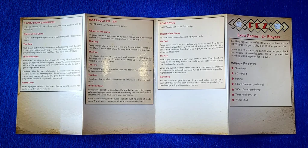
I sent the printer 2 leaflets and each leaflet had a different background for the instruction blocks. That’s my fault, but it gives me a choice to make as to which one I want. I’ll decide and update the relevant document.
I need to use the updated logo(see above) when it’s done and when it’s done use the new ‘cream’ colour to update the gameplay icons too as they use the same muddy cream colour.
Lastly I think I need to try and squeeze a title “Main Instructions”, the other leaflet has a title “Extra Games : 2+ Players”, it’s not a biggie but if I can squeeze it in it’s consistent and clear.
On the Extra Games leaflet I need to take out one of the poker clones and add a different game, there’s 4 poker games so it’s not balanced.
Box Insert
This is the biggest change of the whole box.
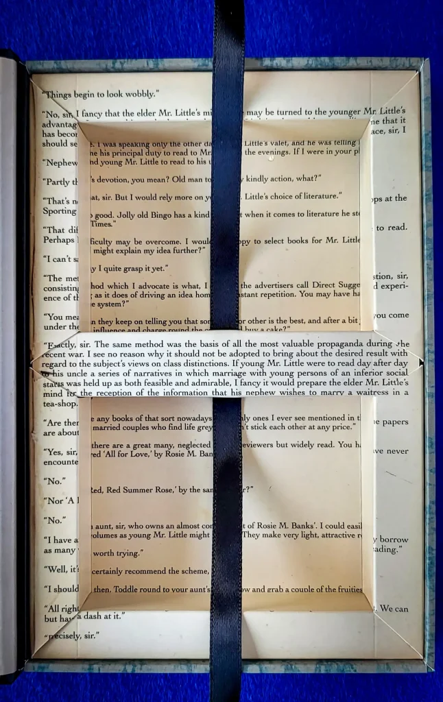
The idea is that it looks like a book, the writing on the book is taken from P. G. Wodehouse Jeeves & Wooster series(out of copyright and free to read from Project Gutenberg). This writing is designed to be able to be read when the cards are removed from the box. The writing isn’t quite matching up correctly.
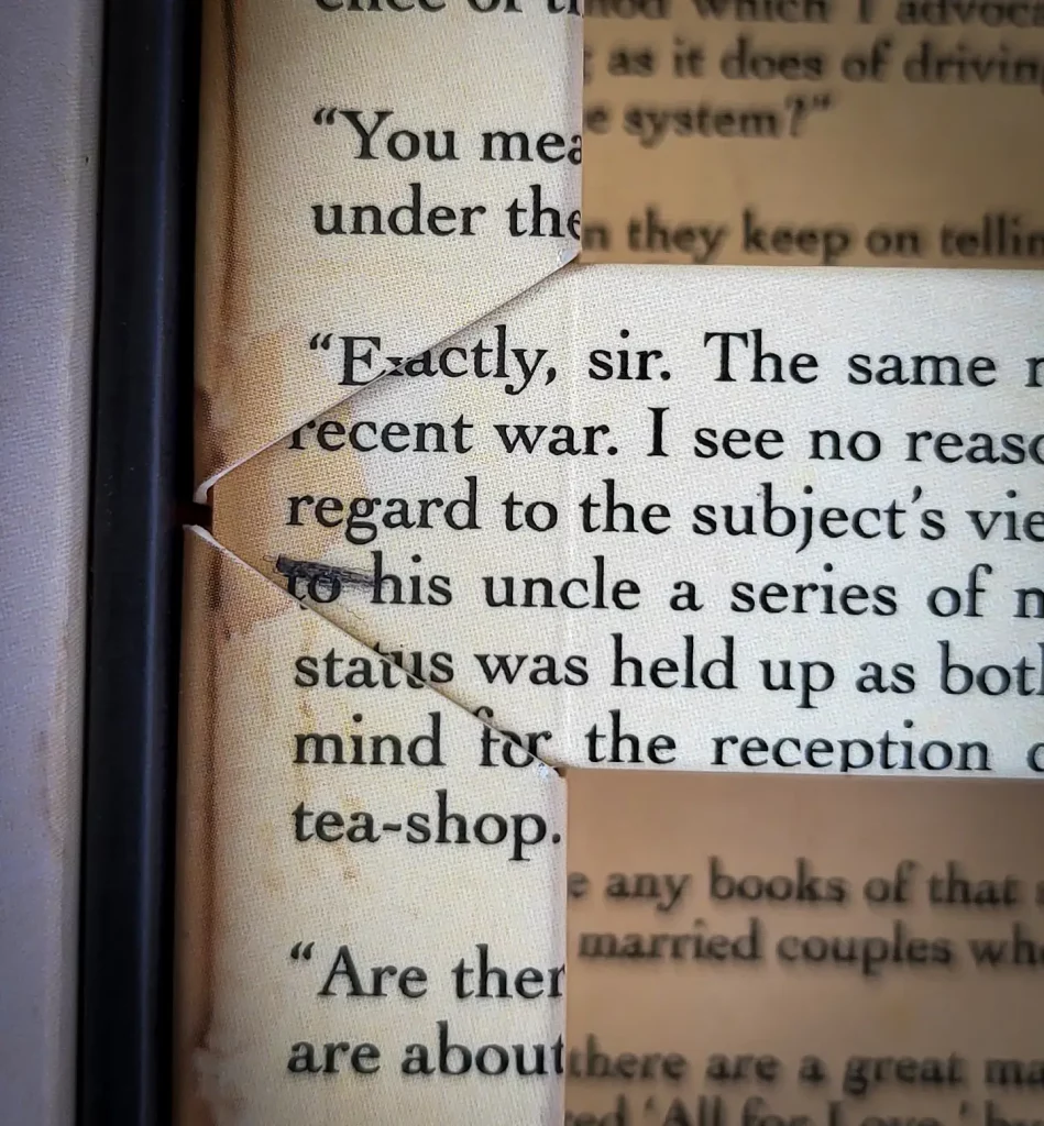
“Exactly”, “status” and “mind for” don’t quite match up.
There is also a small gap on the right hand side.
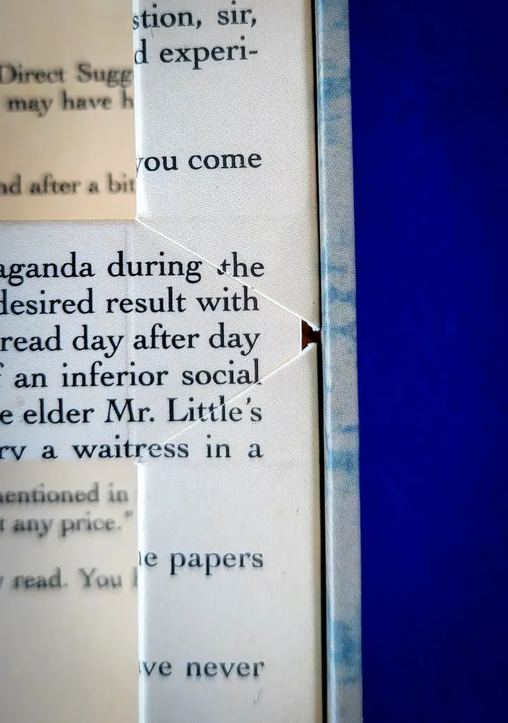
Ironically the writing matches up quite well where the gap is. “Mr. Little’s” and “waitress” match up fine.
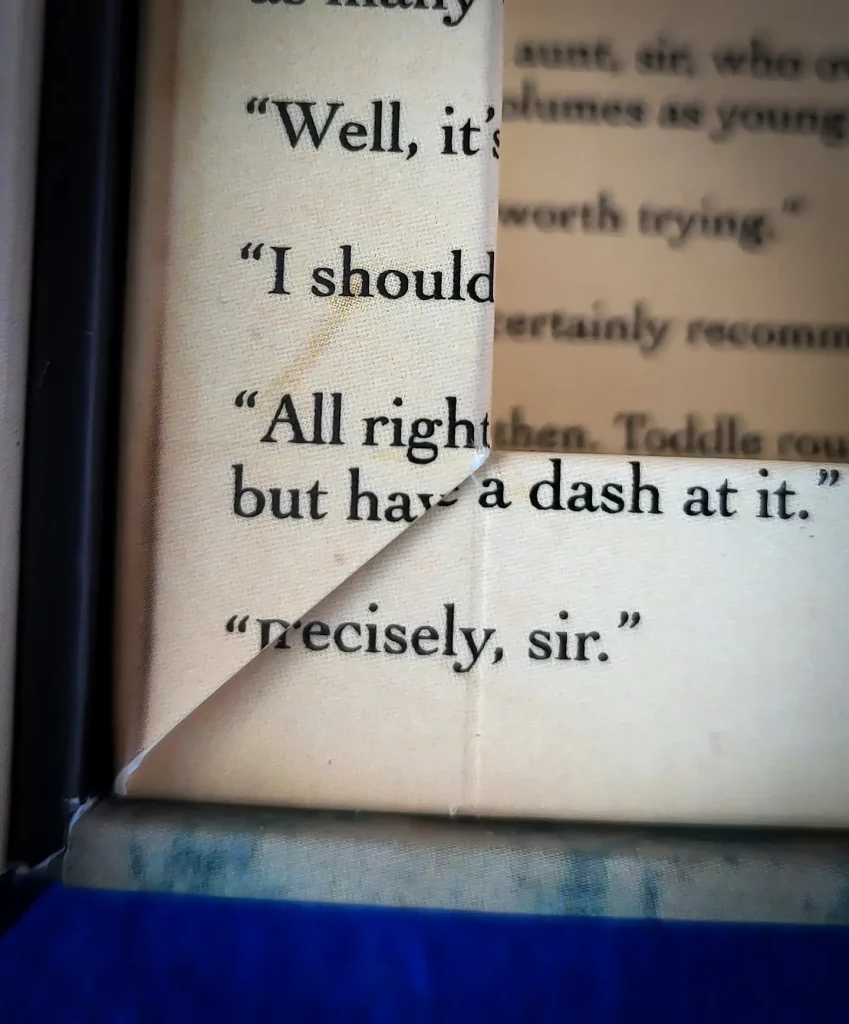
I had used a couple of different inners when I was making my DIY at home boxes, but the printer already had this design. I will talk to them and see what we can do, but one of the designs I have used may be what suggest to them.
Cards
This is also where I’m going to make some changes, not because anything is wrong but to have more consistency and a coherent design.
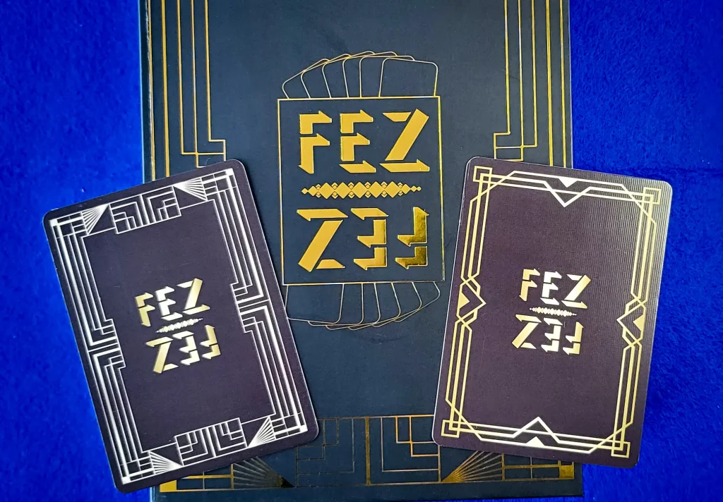
- Foil stamp the card backs
- This will bring the cards in line with the foil stamping on the outer box
- Change the red on the card fronts to be the same as the red on the logo, a colour that is part way between this brighter red and the current darker red on the logo.
- I’ll speak to the printer but I suspect having a black core may help and it may also help for adding foil stamped edge to the cards, the white edge isn’t consistent and isn’t pleasing to my eye. Again consistency, nothing else is white so it’s either plain black edge or gold stamped, if I can I’ll try both and see which looks better.
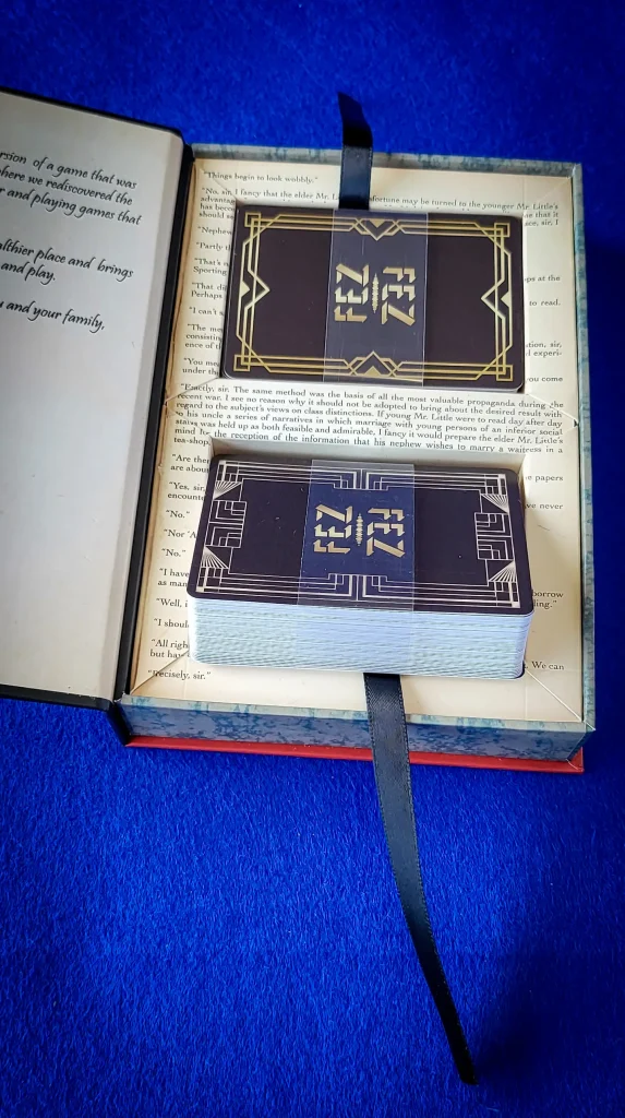
- Whilst on the topic of consistency, if the red on the card front is darker having foil stamped characters might be nice. WJPC send me some samples of other cards to see if there was anything I would like to change, soft touch, back core, holographic edging, vinyl, varnished, etc. and one of the sample cards had foil stamped decals on the card front and it looked really nice instead of plain colour. so I’ll give that a try.
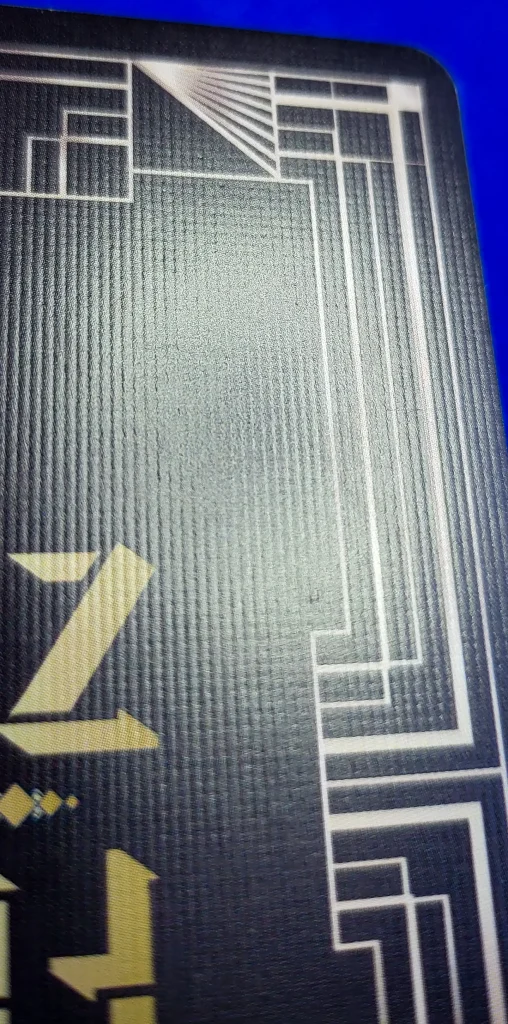
- Also I’m going to ask for linen cards, there is some sort of structure but it doesn’t look like the sample cards that were linen.
Summary
Most of the things I’ve noted to change are me being picky and searching for excellence. Everything apart from the box insert could be acceptable but it’s just not me!
I try to be the best I can and so I’m trying to make the best product I can!! I want a game that will make people’s eyes open wide when they see it, maybe even bring a smile and a wow!
Getting ever closer!!

