Been working on what I think is VERY close to my ideal product packaging. I still haven’t decided on a closure mechanism, but am favouring an elastic wrap as I’ve mentioned in previous blogs.
I will need to take feedback and advice from whichever print and print finisher I end up using. I have rang Card Couture twice with it going to answerphone and followed with another email. Am I doing something wrong? Why aren’t printers responding? 🤷🏼♂️
Front
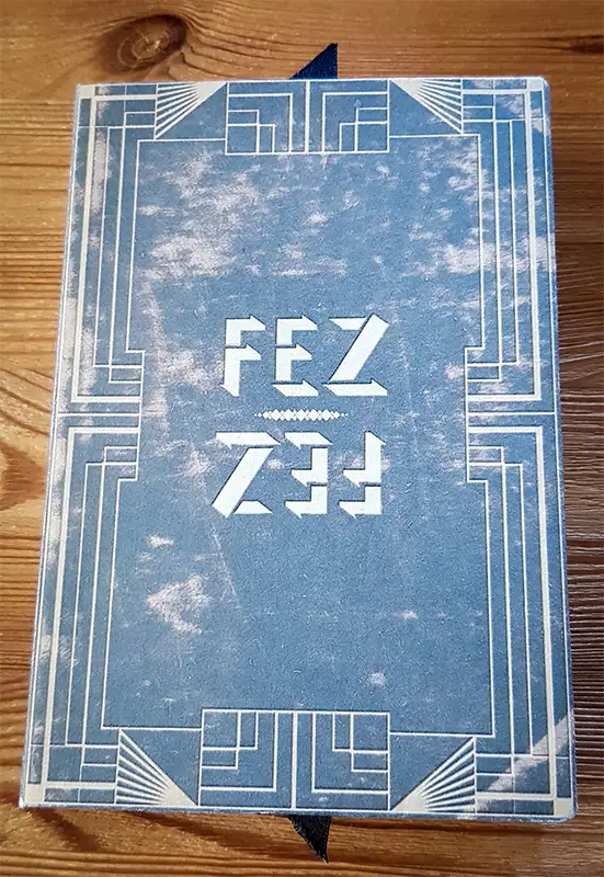
This is a plain front, resembles one of the cards and has a distressed used book texture from texturepalace.com. Many thanks to Sab, some good aged and vintage textures there.
The lettering and art deco framing has a slight de-bossed look that is just photoshopped, dunno if I’d like it actually de-bossed, will take advice from the printer.
Back
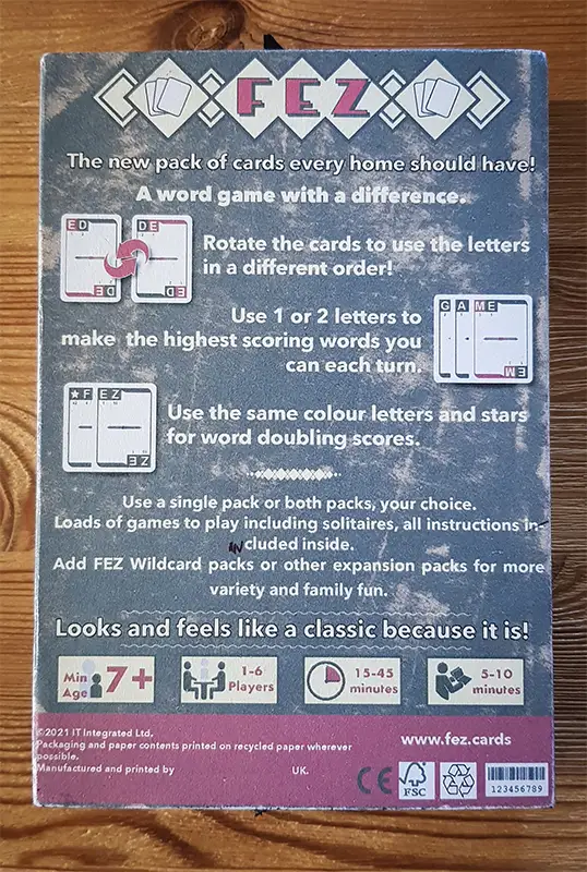
Spent more time on the back to describe as succinctly as possible the game and followed suit with what most games seem to do, leave room at bottom for standard things, such as barcode, manufacturing symbols, etc.. Again the aged book feel is from texturepalace and is the same texture as the front.
I’m hoping that when professionally finished it will give the aged book look and feel that I want 🤞
Big Reveal
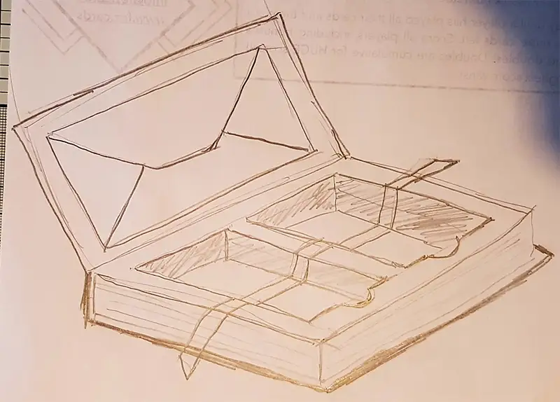
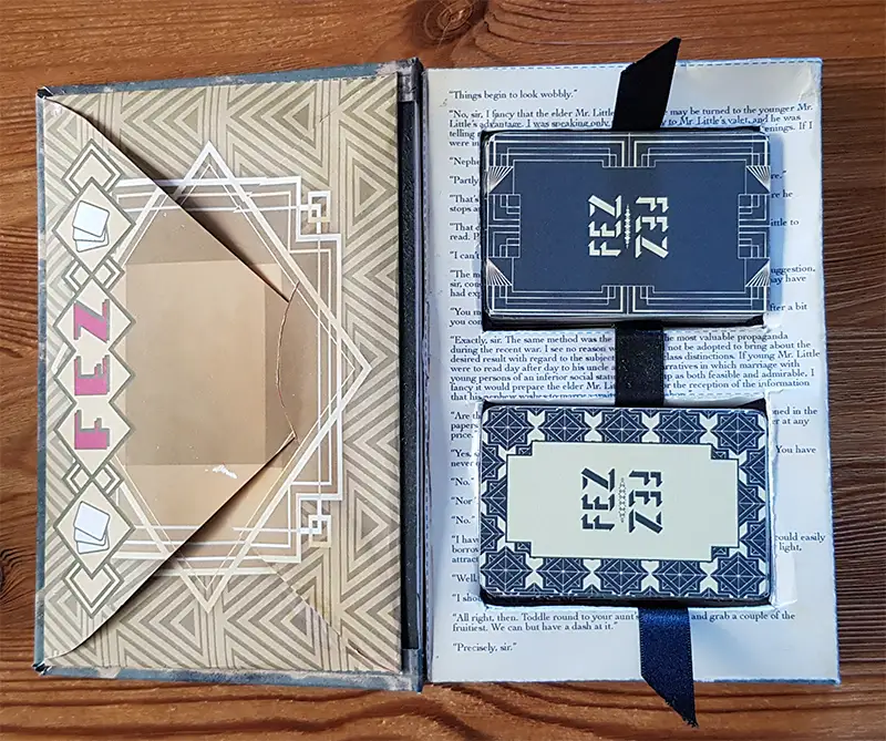
That looks just like I drew in the sketch. This is a build that is designed for the diy bridge size cards I have, but the ribbon pulls work quite well. The actual poker size box I prototyped works even better with a proper printed pack of cards. But since this is to give a feel of what I want I’m happy!
Instructions Envelope
The envelope holds the instructions and game variations leaflets.
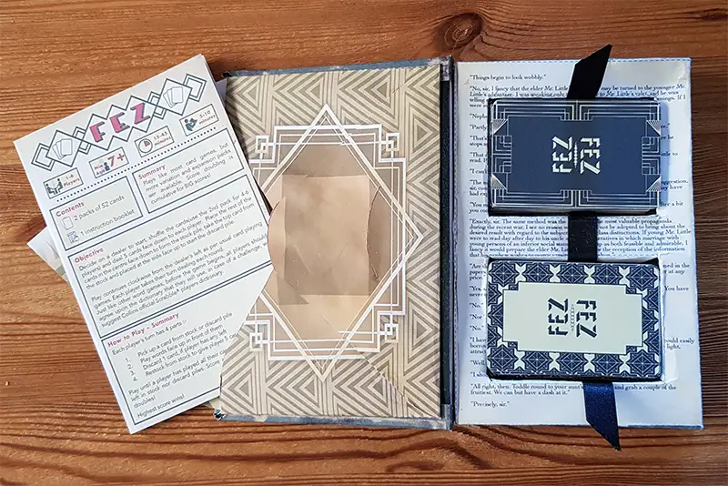
I’ve decided to use a menu leaflet printing style instead of a booklet style as this would most likely need staples and I want to keep as environmentally friendly as possible. Plus this would probably add to the cost. Basically this is a single piece of paper that opens up into 3 pages with 2 folds, just like a menu. I haven’t finished this yet, no pics sorry.
Fitment Box Inside
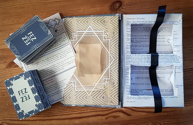
This is what it all looks like open. Instead of using a plain box fitment(where the cards go), I wanted to make it more like a book by having a page of text to read. I designed the die-line(the blueprint of the box as it is printed, with cut and fold lines on it), so that the page could be read even after taking the cards out. I works as well as I could expect even from my home printer.
The page is taken from The Inimitable Jeeves by P. G. Wodehouse available from Project Gutenberg. This is out of copyright now so I can freely use it. I’m also a fan of Jeeves and Wooster the TV series and it fit the 1920’s theme perfectly! “Precisely Sir” as Jeeves would say.
So I’m still hunting for printers that can print the cards and the box, I’ll get there,… eventually!
Next post will be about a local games club we went to this week and how more play testing went. “Very good Sir”.

