So I have the cards and they seem to work, whether anybody wants to play is a different matter just now, they certainly don’t wanna play with the crap I have so far. Time for a bit of design and colour.
Colour is the easiest thing to do I think. Let’s try red and blue instead of regular playing cards traditional red and black.
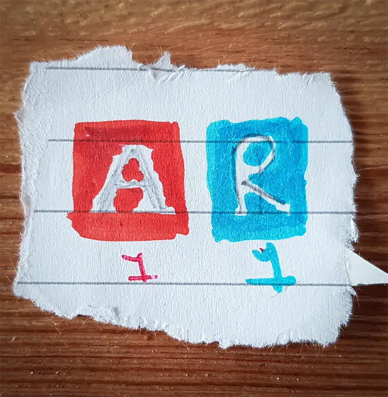
Hmmm… not bad, let’s try it on the cards and see. I didn’t have any labels, but I had some old t-shirt printing paper that is really old and I’ll probably never use again so let’s try that. You print on the paper in a mirror image and when you lay the paper on and iron it, the ink comes out onto the material underneath. So I ironed on and gave it a try.
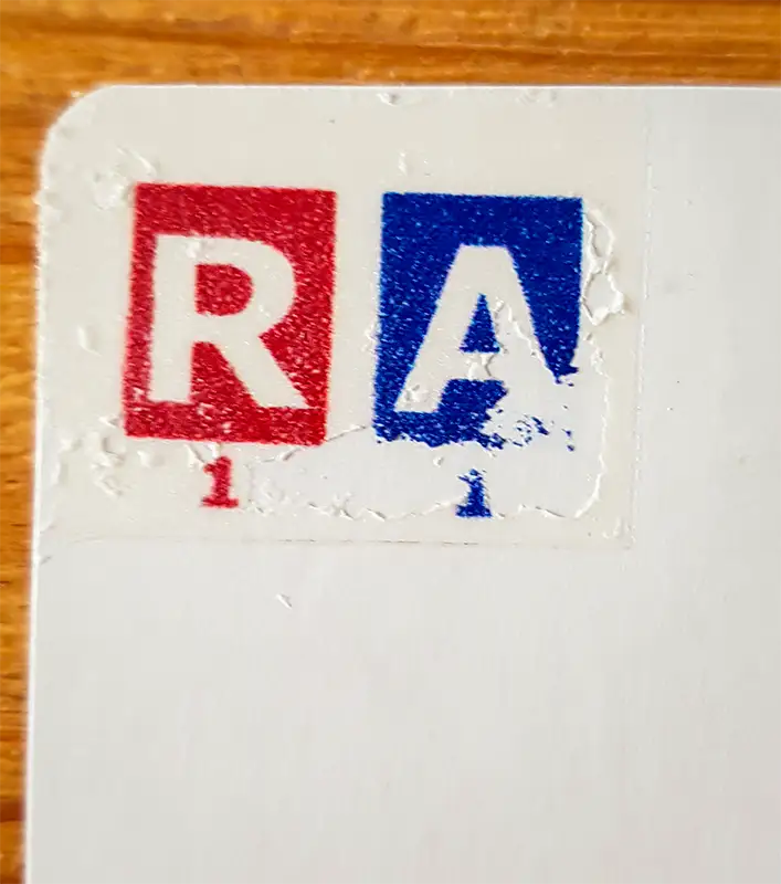
Nope, that ain’t gonna work, the paper was pulling off as I was pulling the sheet off the card leaving only a partial image.
Haha!! I dug around again and found some old CD labels let’s try that!
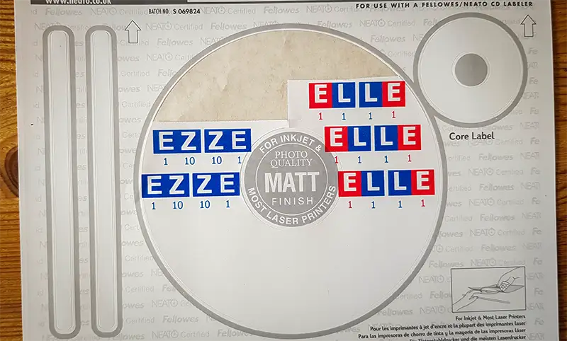
Colours look better and they should transfer ok, just a lot of cutting out! and a LOT of mucking around to get them to fit inside the label part… c’est la vie.
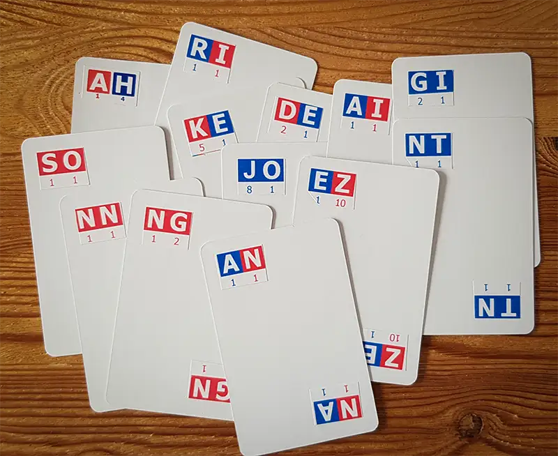
Something doesn’t feel right! The cards look weird. There’s too much white space in the middle. Let’s try something.
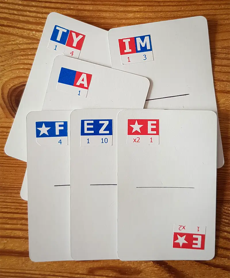
They look better with the line divider I added, but the line doesn’t quite feel right, it’ll do for now. They look a lot better than my hand written ones, but they need a box of some sort. I looked around and found some bits of cardboard. I had some old postcards in a drawer and thought they could be useful. It’s a word game so I didn’t just want a regular playing card tuck box. I had a little notebook that I’ve always liked, with a bit of elastic to keep it closed.
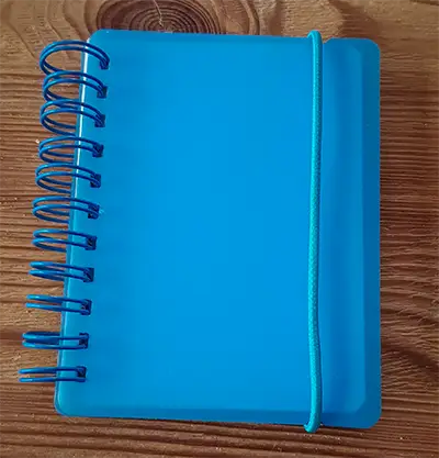
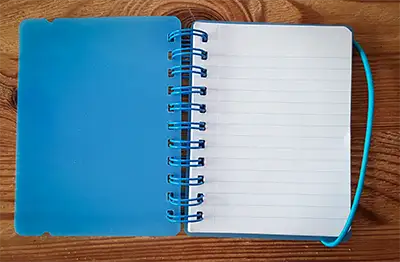
I decided I wanted to do something similar. After some measuring and cutting I came up with this.
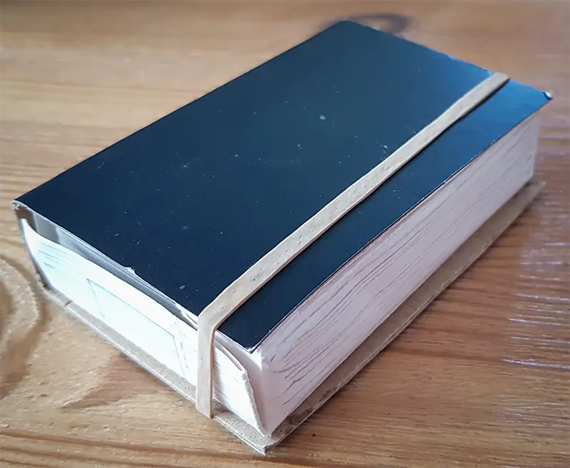
Even though it was bound with an elastic band and didn’t fully wrap (the postcard was a little too short) I was happy I was going somewhere I liked the look and feel of.
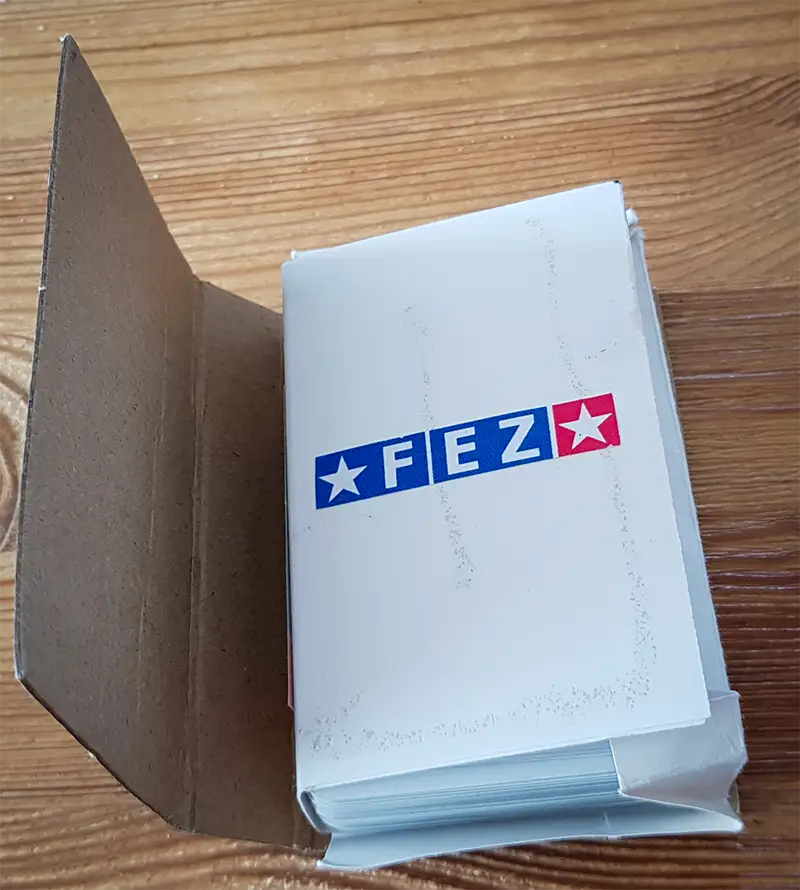
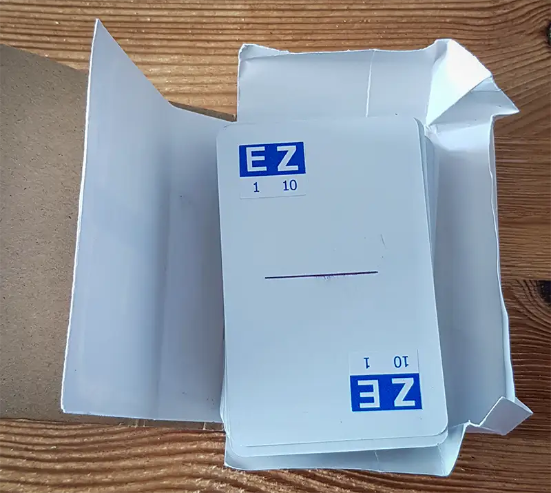
Ok, now let’s type up some rules and make them fit into the box. I’ve long since lost the original rule sheet, but the font size was too small and it was very dull and not interesting to look at, a bit like the bible or a sports news article with no pics. The font was no smaller than you find on the back of playing cards or ingredients on a grocery item, but it wasn’t good enough. Once folded in half, it was slightly bigger than playing card size and fitted inside. It did for now as an idea of how I wanted things to be and was definitely going in a direction I was liking.
Now let’s test it with some people!

